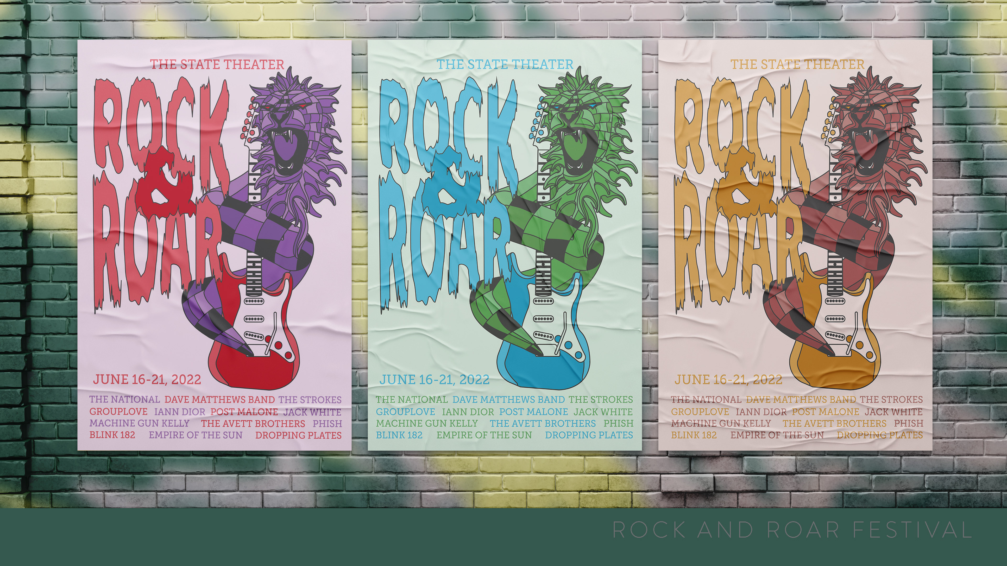

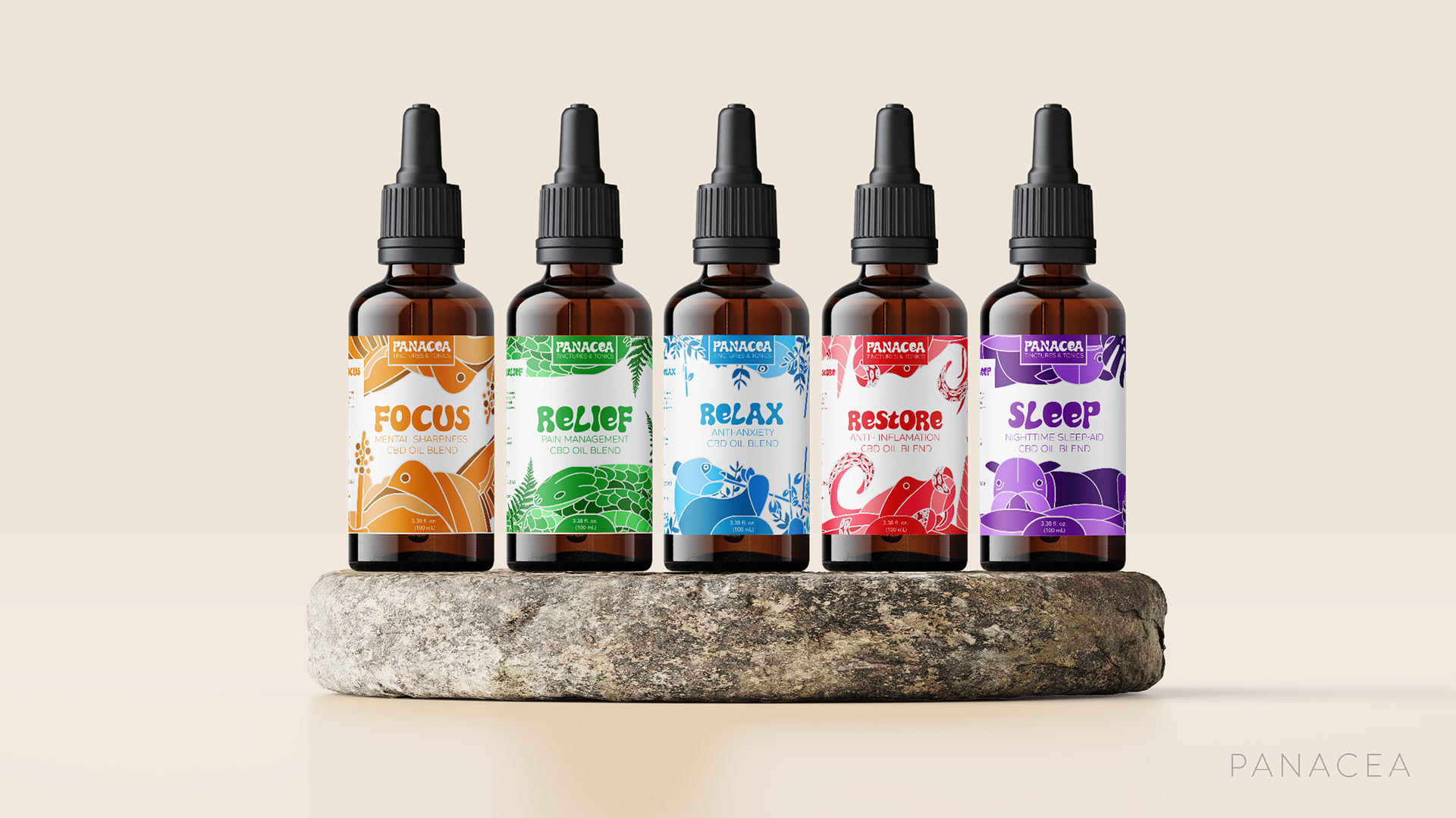

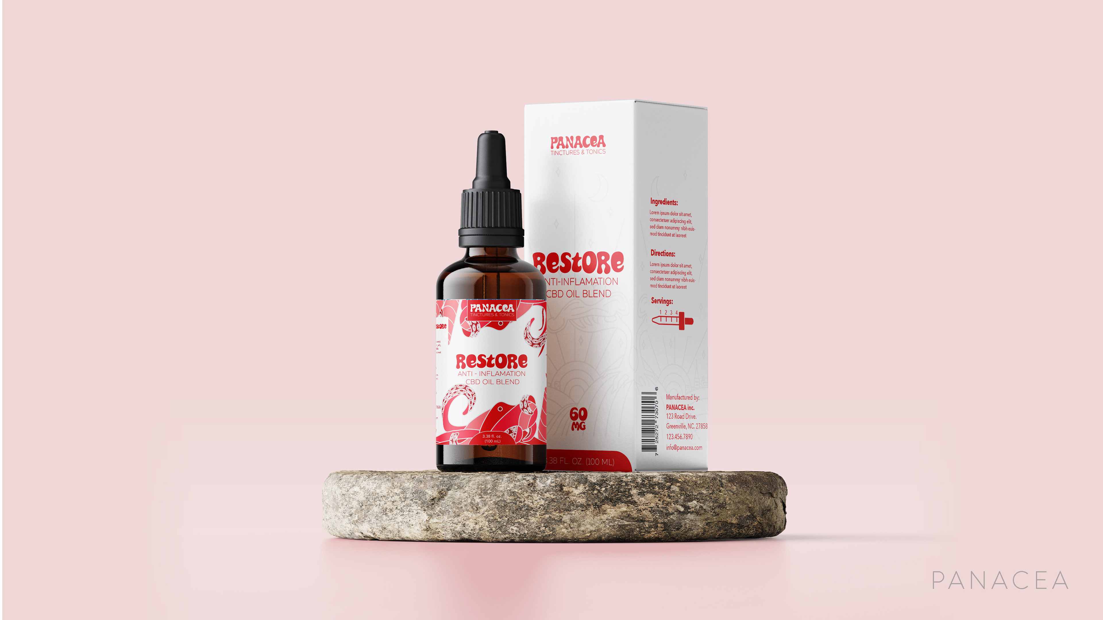
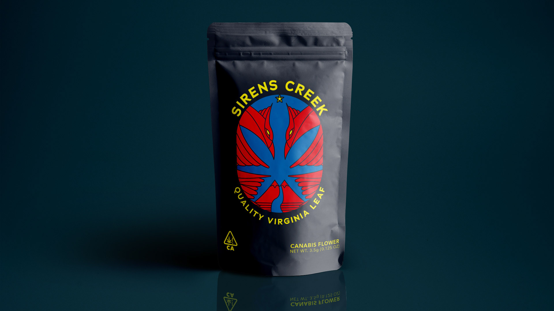

Hi! My name is Matt Barnhart. I am a graphic designer and illustrator hell bent on designing unique products with a focus on structure and bold use of color. Excelling in the drawing inspiration from seasoned design concepts and placing a modern spin on said concepts to create balance between young and old is the name of the game. Design is an amazing medium for the collaboration of people, this makes every project a new adventure for myself and my collaborators. Every client, every employee, every peer provides unique points of view that when given proper direction and nourishment can grow to create beautiful ends.
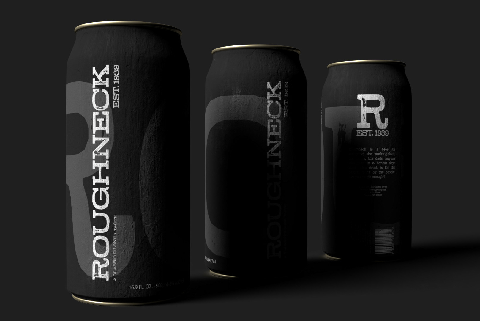
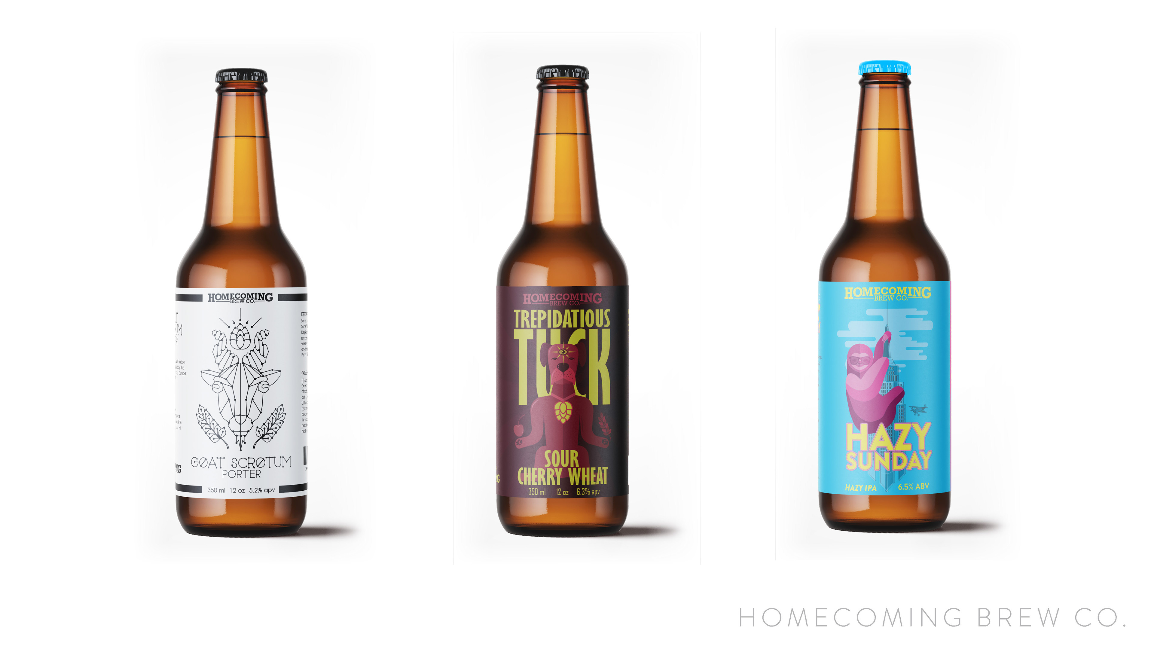
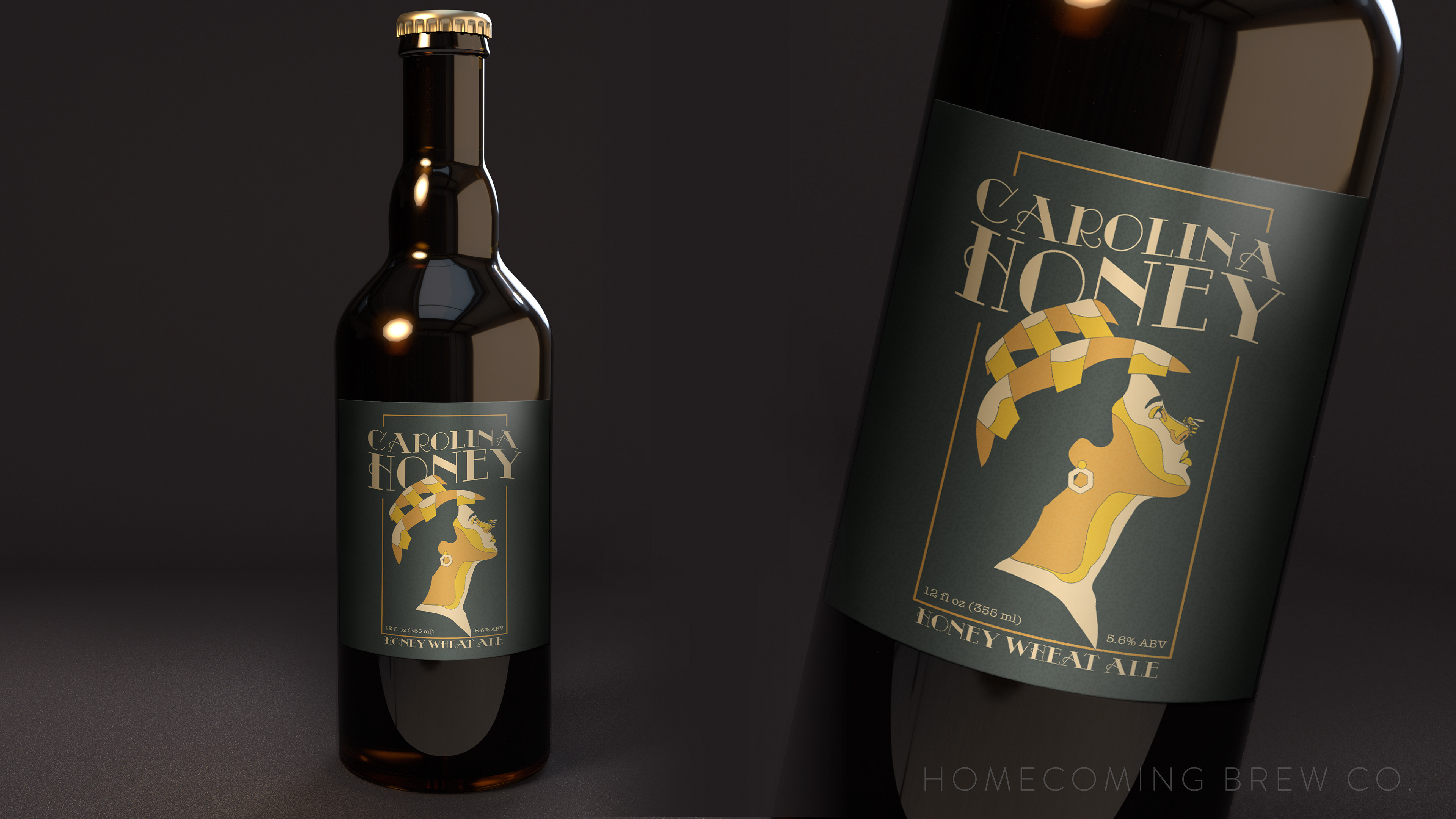
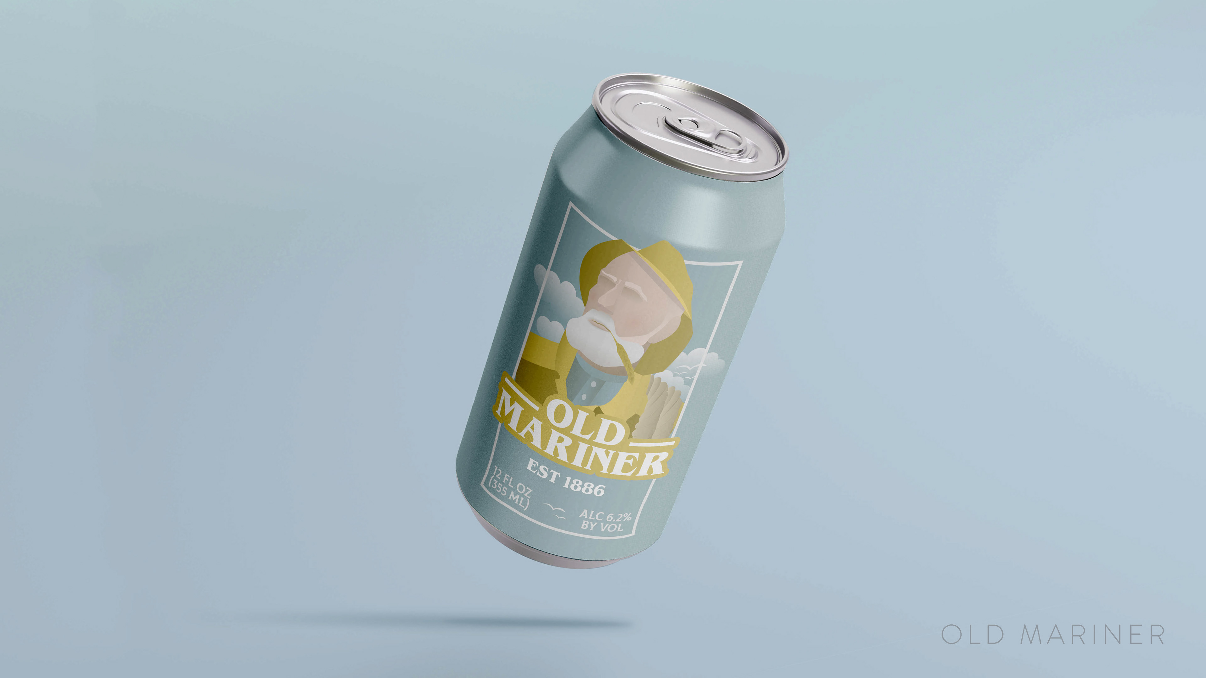
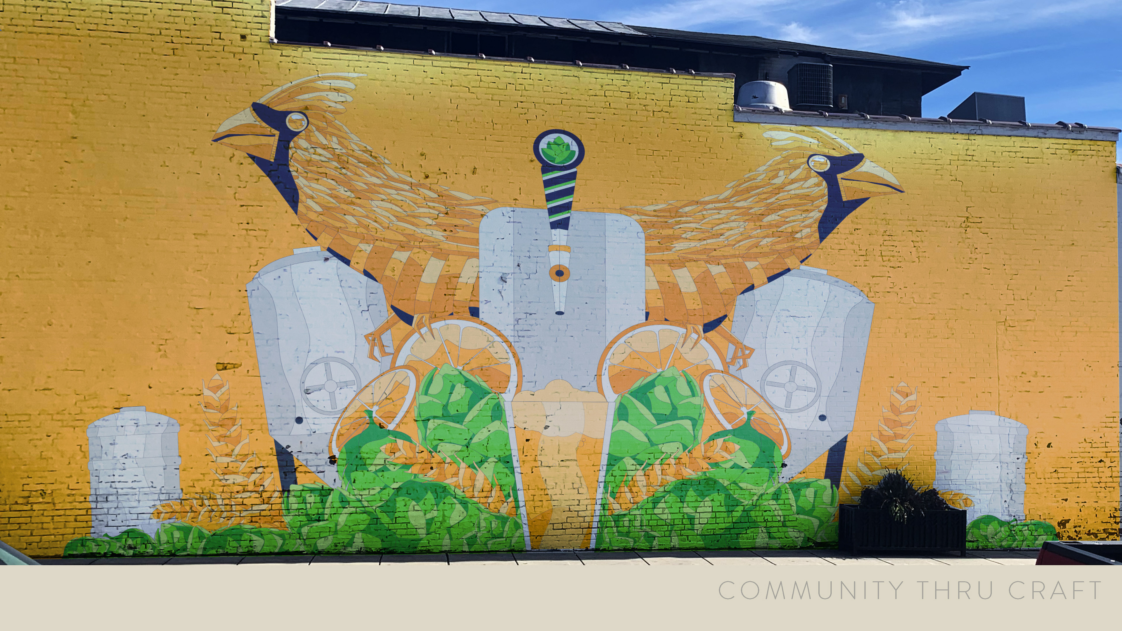
I am passionate about many things but I frequently find joy in package design. I love the statistic that 40 percent of shoppers enter a store without their minds made up on what they want to purchase. Another 20 percent change their mind while in the store. This means that you have the opportunity to effect 60 percent of shoppers with amazing package design. This concept absolutely fuels my passion. An area of packaging I am specifically drawn to is beer. I love everything about beer. The process of making beer itself is such and amazingly beautiful art form that is so inspiring. Having such an amazing backend process inspires one to make beautiful representations on the front end (design wise). I believe my love of beer stems from my love of people, each beer has different personality and leaves you with different emotions. You may have a fun in the sun light lager that leaves you felling summer vibes. On the other hand you could have a full bodied spiced lager that lulls you to sleep with an embrace of warmth. I love to treat each beer like it is it’s own client and try to build a design that reflects said clients personality.
I am also a big believer in the “If you see a problem fix it” mantra. This plays heavily into my work I am very much inspired by fixing problems in design. That may be an over used symbol in the industry, which results in over saturation and by extension the image becoming “corny” or cliche. I look at theses images and see opportunity for creating unique ways to display the information. I find use of negative space to be a major partner in my crusade to fix the normality of design. Negative space can be used to find unique ways to make the normal abnormal.
Ultimately the goal of design is to sell an individual one something. Whether that be sell a client on a design itself or sell a potential buyer on a product itself (or both in combination). I find that a combination of delving into historical context and drawing inspiration from modern context can create a winning combination when it comes to creating successful designs.
